The Power of Visual Branding
THE SILENT AMBASSADOR
The Power of Visual Branding
First impressions are formed in 0.05 seconds. A strong visual identity makes it count.
Anatomy of a Visual Identity
A cohesive system of elements working in harmony to tell your brand's story without saying a word.
Logo
The cornerstone of recognition; a simple, memorable mark.
Color Palette
Communicates emotion and meaning, shaping perception instantly.
Typography
The voice of your brand, establishing a distinct personality.
Imagery
Crafts a visual narrative through photos and illustrations.
The Tangible Value of Visuals
Strong visual branding isn't an expense, it's a core business asset that drives measurable results.
+23%
Increase in Revenue
Can be achieved by presenting a brand consistently across all platforms.
+80%
Increase in Recognition
A signature color can dramatically boost how well your brand is remembered.
75%
Recognize by Logo Alone
Showcasing the logo's power as a primary identifier.
81%
Need Trust Before Buying
A professional visual identity is the foundation of consumer trust.
90%
of Snap Judgements Based on Color
Color is a primary driver in a consumer's initial assessment and purchasing decision.
Our Strategic Framework
A disciplined, three-phase process that transforms strategic insights into a captivating and enduring visual identity.
01
Discovery & Strategy
We audit your brand, define your 'why', identify your audience, and research competitors to build a solid strategic foundation.
02
Design & Development
We translate strategy into tangible assets—logo, color, typography, and imagery—creating a cohesive and flexible visual system.
03
Execution & Governance
We roll out the new identity across all touchpoints and create comprehensive brand guidelines to ensure lasting consistency and integrity.
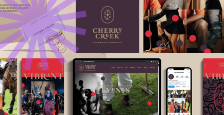
The Silent Ambassador: Your Visual Brand’s Power to Transform Business Performance
Your Brand Speaks Before You Do
Picture this: A potential customer encounters your brand for the first time. In just 0.05 seconds, before reading a single word of copy, they’ve already formed an opinion about your company based solely on visual presentation. That split-second judgment determines whether they’ll engage further or scroll past, whether they perceive you as trustworthy or amateur, whether you’ve earned their attention or lost it forever.
This lightning-fast assessment creates a challenge every CMO faces: How do you ensure your visual identity communicates the right message instantly, consistently, and powerfully across every touchpoint? When growth has stalled despite increased ad spend, when competitors capture market share with seemingly inferior products, the problem often lies not in your media strategy but in the silent story your visuals tell.
At Trace Brand Building, we’ve witnessed this scenario countless times. As a creative agency in Denver, we understand that your visual identity serves as your most immediate and powerful ambassador. Through our MAGIC Audit, we diagnose precisely where visual inconsistencies erode trust and dilute your message, then rebuild your brand’s visual system to command category leadership.
The Anatomy of Visual Identity: More Than Just a Logo
Your visual identity encompasses far more than a logo slapped on business cards. Each component plays a distinct role in creating a cohesive brand experience that transforms recognition into revenue.
The Logo: Your Cornerstone of Recognition
Your logo anchors your brand in the consumer’s mind, serving as the most prominent and recognizable symbol of your company. According to research from G2 Learning Hub, 75% of consumers identify brands by logo alone. The world’s most effective logos share three characteristics: simplicity, memorability, and authentic reflection of brand ethos. Consider Nike’s swoosh – a mark so powerful it requires no accompanying text, achieving global recognition through disciplined consistency.
Color Psychology: Your Emotional Telegraph
Colors communicate on a subconscious level, triggering psychological responses without a single word. Your color palette serves as a strategic selection of hues designed to reflect personality, influence perception, and reinforce recognition. Research indicates that strategic use of signature colors increases brand recognition by 80%.
Blue conveys trust, dependability, and stability – explaining its dominance in financial and technology sectors. Red creates urgency and excitement, stimulating appetite and encouraging impulse purchases. Green symbolizes growth, health, and renewal, naturally fitting wellness and sustainability brands. Our brand development process carefully selects colors that align with your strategic positioning, not personal preference.
Typography: The Voice of Written Communication
Typography gives voice to your brand’s written communications, encompassing specific fonts, sizes, and stylistic treatments across all materials. Serif fonts project tradition, authority, and reliability. Sans-serif fonts appear modern, clean, and approachable. Script fonts convey elegance, creativity, or artisanal quality. Consistent typography establishes distinct brand personality, making any text instantly recognizable as yours.
Imagery and Visual Style
Photography, illustrations, and visual art must remain meticulously curated for consistency with your brand’s tone and message. Whether professional and polished or whimsical and organic, unwavering consistency creates recognition. Our creative campaigns ensure every visual element reinforces your strategic narrative.

The Psychology Behind Visual Impact
The profound impact of visual branding roots itself in fundamental human psychology and cognition. Our brains process visual information at astonishing speed, forming opinions about brands in mere milliseconds based on visual presentation alone.
The Speed of Sight
Research shows it takes only 0.05 seconds for people to form opinions about brands based on visual presentation. Up to 90% of snap judgments about products stem from color alone. This instantaneous assessment sets the emotional tone for every subsequent interaction, creating immediate trust or distrust before copy gets read.
Cognitive Biases That Build Trust
Consistent visual identity leverages the mere-exposure effect – a psychological phenomenon where people develop a preference for familiar things. When consumers repeatedly encounter your consistent logo, colors, and typography across platforms, familiarity breeds safety and predictability. Over time, predictability evolves into dependability and trust, crucial precursors to long-term customer relationships.
The Shape of Perception
Shapes communicate subconsciously, carrying inherent psychological weight. Circles suggest community, unity, and wholeness, evoking a feeling of inclusivity and harmony. Squares convey stability, reliability, and strength – appearing solid and trustworthy. Triangles imply energy, power, and direction – suggesting progress and innovation. Our positioning work aligns every visual element with your strategic objectives.
The Tangible ROI of Visual Excellence
Visual branding translates directly into measurable business outcomes, providing a clear return on strategic investment.
Driving Recognition and Revenue
Statistics overwhelmingly support the effectiveness of visual branding. Strategic color use increases brand recognition by 80%, while consistent brand presentation across platforms can increase revenue by up to 23%. Furthermore, 60% of companies report that brand consistency drives 10-20% of revenue growth.
Building Trust and Loyalty
Polished, professional, consistent visual identity enhances perceived quality and reliability, building consumer trust. This matters because 81% of consumers must trust brands before making a purchase. When customers feel emotional bonds with brands, 43% spend more money on those they’re loyal to. A consistent visual system makes brands feel credible and less risky, while an inconsistent appearance feels unprofessional.
Creating Competitive Advantage
In crowded markets, differentiation proves essential for survival. A unique and memorable visual identity sets brands apart from their competitors. Research shows 60% of consumers actively avoid brands with unattractive or outdated logos. Strong visual identity helps brands stand out in advertising seas, making customer recall and choice easier. New market entrants should deliberately select colors, ensuring clear differentiation from competitors.
Our Strategic Framework for Visual Transformation
Creating a powerful, enduring visual identity requires a disciplined strategic process, not a purely creative exercise. At Trace Brand Building, we transform strategic insights into captivating visual expressions through our proven three-phase framework.
Phase 1: Discovery and Strategy
Before building futures, we thoroughly understand the present. Our comprehensive MAGIC Audit reviews existing brand assets, analyzes perceptions, and assesses competitive positioning. We articulate your fundamental purpose, vision, mission, and values – the foundation for external communication. Through detailed buyer persona development, we gain a deeper understanding of your audience’s needs, challenges, and aspirations.
Phase 2: Design and Development
With a clear strategy established, creative design begins. We develop core visual components, including simple, memorable, and versatile logos; strategic color palettes informed by psychology; typographic systems that reflect the brand voice; and imagery guidelines that ensure cohesive visual assets. All elements integrate into a flexible visual language applicable across media.
Phase 3: Execution and Governance
Brilliant visual identity proves useless without consistent application. We document all rules in detailed brand guidelines specifying exact color codes, logo usage, typography hierarchy, and imagery standards. Implementation rolls out consistently across every touchpoint – websites, social media, packaging, advertising, and internal communications.
Digital-First Visual Strategy
Digital proliferation fundamentally changed branding landscapes. Visual identity must now function as dynamic, adaptable systems built for screens, motion, and constant connectivity. Our marketing implementation ensures your brand thrives in digital environments.
From Static to Dynamic
Motion graphics capture interest and convey information through animation, kinetic typography, and micro-interactions. Animated logos bring primary identifiers to life in video intros and social posts. Leading brands like Apple and Nike integrate motion graphics throughout their branding, demonstrating features and amplifying emotion.
Designing for Every Screen
Digital-first strategy prioritizes optimization for websites, social media, and mobile devices. Logos must remain recognizable from desktop monitors to smartphone app icons. Typography must stay clear on small, backlit screens. User interface elements must maintain brand aesthetic while creating seamless experiences.
Learning from Success and Failure
Real-world examples illuminate visual branding’s power and pitfalls.
Masters of the Craft
Apple demonstrates the power of minimalism through sleek lines, monochrome palettes, and elegant typography, directly reflecting its philosophy of simplicity and user-centric design.
Nike’s swoosh symbolizes movement and victory, supported by bold typography and aspirational imagery communicating “Just Do It.”
Coca-Cola achieved global recognition through unwavering consistency – their distinctive red shade, script logo, and bottle contour are instantly recognizable across cultures.
Cautionary Tales
The 2010 Gap rebrand replaced its iconic 20-year logo with a generic Helvetica font, triggering immediate backlash. Within six days, they retreated to the original, learning that visual identity represents years of shared customer experience.
Tropicana’s 2009 redesign replaced its familiar orange-with-straw image, causing sales to plummet by 20% as confused customers struggled to recognize products on shelves. They quickly reversed the decision, demonstrating the value of familiarity.
Transform Your Brand from Overlooked to Unmistakable
This comprehensive analysis demonstrates that visual branding operates at the intersection of art, psychology, and commerce. Well-crafted visual identity builds recognition, fosters trust, and drives measurable financial growth.
Your visual identity serves as a silent ambassador, instantly communicating your story, values, and promise. When strategy guides every visual decision, brands command categories rather than compete within them.
At Trace Brand Building, we deliver verified 10% sales lifts within 90 days through comprehensive visual transformation. Our recent builds achieved a median 34% lifts by aligning visual systems with strategic positioning.
Book your MAGIC Audit today to discover how we transform your visual identity from forgettable to iconic.